Our New Jurisdiction Picker
Note: This is a technical post exploring and documenting the work that was done in order to build our new jurisdiction picker. If you're not technically-inclined (or at least curious), you may want to move along before getting sucked in.
While prepping to import the Lawbox corpus, one of the many things we did was redesign our jurisdiction picker so it would support more than 350 jurisdictions. Completing this efort was a collaboration between me and a volunteer contributor, Peter Nguyen. Peter and I worked together iteratively, first building a wireframe of the jurisdiction picker, then a prototype, then the final version that you see today.
Before beginning, we outlined the use cases that the new picker should support. It should:
- Allow a user to select a single jurisdiction;
- Allow a user to select all jurisdictions from state, federal, district, bankruptcy or all of the above;
- Allow a user to select in hybrid mode -- expanding a selection of a state courts to the related federal courts or vice versa;
- Allow users to easily select the courts they desire by filtering to the ones they're interested in;
- Support more than 300 jurisdictions without taking up too much space; and
- Be responsive and fast.
In our version we released yesterday, we accomplished most of these goals. Using the links at the top of the picker, it's easy to select or clear an entire tab, a collection of tabs, or all tabs. Using the filter, it's easy to select by typing, allowing our users to select the courts they want without skimming long lists. By typing just a few letters and pressing enter, you can make sophisiticated jurisdiction selections.
There are still a few features we'd like to add to the picker, and you can watch for them soon. One is the hybrid selection mode, and the other is synonym support, so that typing words like "Eastern" will return courts in the "E." district.
On the backend, we ran into a couple challenges while building the new picker. First, Internet Explorer 8 and below only support about 2000 characters in a URL. This causes lots of problems across the Web, but for us it meant that users selecting lots of jurisdictions would run into problems. The id codes we use for the jurisdictions are about four letters long, each, and our URLs used to look like
&court_id=ca2&court_id=ca3&court_id=...
For every jurisdiction selected, it would send &court_id= along for the ride, making the URLs very long. Our new version tweaks this so that all the court identifiers are simply separated by a comma and sent in a single block. Much better, and of course the old URLs still work so long as they're short enough.
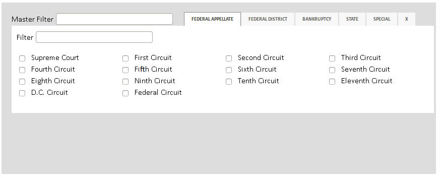
As we built the new court picker, we had several iterations. The first was a basic wireframe like so:

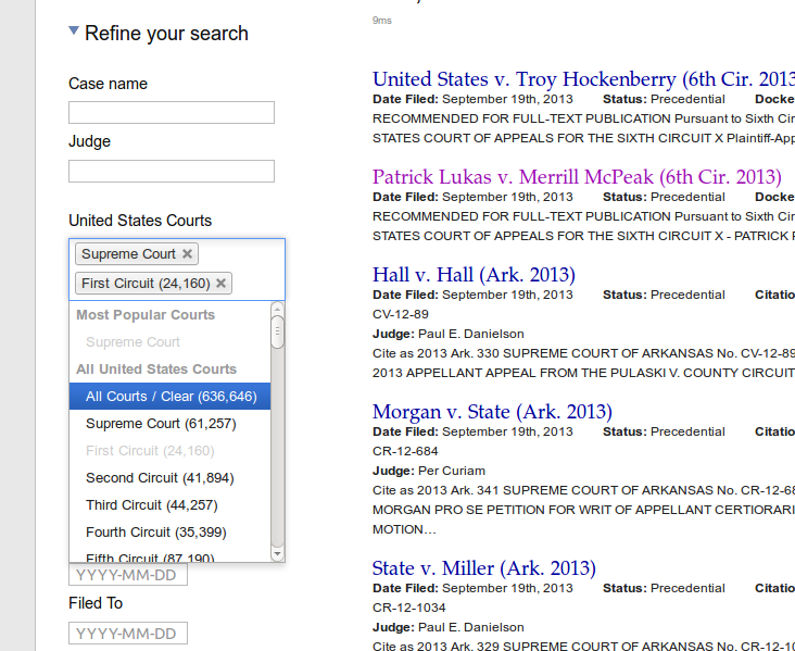
This didn't work at all, but it provided a pretty good place to start. Around the same time, Peter was experimenting with the Chosen jQuery plugin, and built a prototype that greatly enhanced our sidebar without forcing people to use modal dialogs:
 ](http://notskool.me/courtlistener/header-chooser.htm)
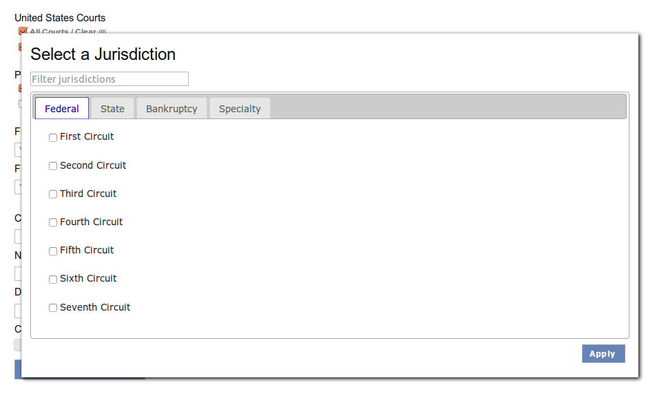
Not bad, but it made it very difficult to select lots of jurisdictions, which was a problem. We did another iteration of the modal dialog, and ended up with a working demo that looks like this:

Our final version is quite similar, but is changed in a couple significant ways. It has "Clear" and "Select All" links at the top, and it changes the filter so that it checks boxes as you type rather than hiding them out of view. The final version is now live on the site, and should provide a great foundation as we move forward. We're already investigating more jurisdictions, and we expect it won't be too hard next time.


